
Olympic Brands —
From Pencils to Pixels
We are about to see an enormous celebration of nationality in the next few weeks across our televisions. The Olympics are the world’s most visually spectacular event of modern times and attracts designers to fashion their country’s emblems and uniforms to say something about themselves in terms of identity. The effort, usually enormous by the host country, rounds up every favour it can to ensure they’re showcasing their nations finest.


The Brits, true to form have been pulling out all stops for the entire year; starting with a royal wedding and then followed by the Queen's Jubilee and all manner of festivals and exhibitions, all building towards the crescendo of absolutely sparkling sport that we are set to witness in these next few weeks. “London Calling” BBC's programming call sign is a brilliant expression of all things British. There's no doubt about it the Brits do festivals like no one else. From the late Amy Winehouse to the ever-current Elton John, every balladeer they can muster will be strumming something, despite the rain, traffic, and that dreadful Heathrow Airport, the poms will be strutting their stuff.
The Olympic symbol designed by Baron Pierre de Coubertin, founder of the modern Olympics movement, is based on patterns common in ancient Greece. The five rings represent Africa, the Americas, Asia, Europe, and Oceania; every national flag in the world includes at least one of the five colours. Knowing what it takes up close, I can't imagine the infighting and hiding to nowhere which the designers pursue in delivering the best logo yet.

Otl Aicher pictograms for the 1972 Olympic games
I am no Olympic junkie but I have to say my colleague Julian knows every typographical serif down through the years. Julian pointed out to me the work of Otl Aicher who was the design director for the Munich 1972 games. His set of graphic pictograms of each sport were breathtakingly elegant, with the kind of clarity that perhaps will never be topped. He was the founder of the Ulm design school and a consultant to Braun and the German airline Lufthansa. The quintessential German designer with Bauhaus principles, Aicher gave us ‘cool’ well before we misused the word. He also championed logical design on the back of the flamboyant and colourful ‘flower power’ 60’s - how visionary is that!
Sadly, Munich was the ill-fated games where we saw the Israeli team taken hostage and subsequently murdered by terrorists. And over the years we have seen the event polarize people no matter how hard nations try to avoid mixing politics and sport. Of course all of this was designed well before the digital age and I wonder what Aicher would have done with pixels as opposed the pencil images he created. In his day Photoshop was literally a place where you went to buy photos in the high street.
The wonderful work of Michael Tompert and the team at Raygun Studios for BMW (sponsors of the US Olympic Team) showcase how Otl Aicher's principles are still relevant today. Using purposeful purity combined with the iconic spectrum of Olympic colours on black, they’ve captured the moment of the human triumph that we can only marvel at in an Olympian in a beautifully simple way. Aicher’s quintessential Daschund is the perfect symbol representing Germany in 1972. A far cry from the hideous London Jigsaw symbol of Wolff Olins, which only reinforces the stereotypical image of stoic Britishness. Perhaps its inspiration was Boris Johnson's hairdo? We are sure to see the entire spectrum over the next few weeks.
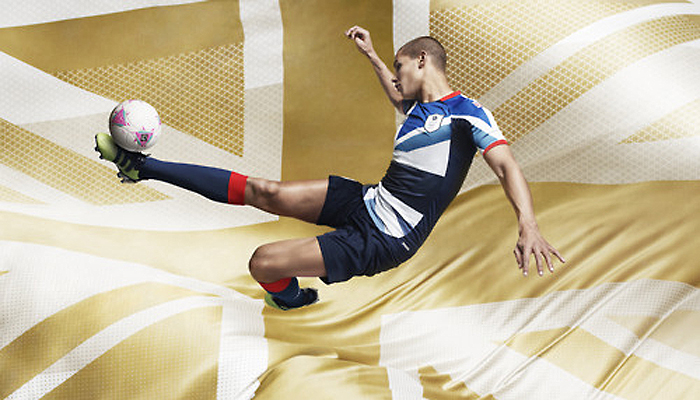
We live in an age of democratized design, courtesy of ever developing software that averages every space and template delivering unsurprising iterations of things we’ve seen before. Stella McCartney's work for Great Britain is very cool. And with her dad Paul, singing at the opening probably and her design for GB’s team uniform a big family turnout is guaranteed.

Coca-Cola, good on them, have the money and resolve to deliver something great. It's not easy to surround your product with an event like this and maintain your identity from a design perspective – but through the edition of collectible bottles, they’ve shown that it is possible. I suspect they'll jump into the Coke Museum in Atlanta and become very collectible. It’s only when you see the great work of masters down through the years do you begin to see how little we’ve advanced despite all this technology. Ideas-based design is still a craft of great refinement and the joy of seeing it and living with it is something to be immensely valued. I shall watch with interest the colourful costumes, and each teams efforts to communicate something of themselves and their nation in a single graphic element or garment design.

There will be some countries caught up in a time warp and others who will try to express where they are going. I think that's what's so wonderful about the event and the way in which the Olympians wish to characterize themselves. Of course there are exceptions, Ralph Lauren made himself very unpopular with US Congress by designing the American teams outfits and having them made in China. Obviously couldn't keep his hands off the margin. Still a good look though.
Visually with all the technology we now have, it promises to be spectacular entertainment. Take note of distinctive thoughtful design and the nations who get it right. The great design you see won't be about clever pixels, but rather the idea behind it - the magic that will capture you.
Look out for that lasting image and its ability to move you.